
New Design Museum in London hasn’t received great reviews, and unfortunately I have to agree that from the user’s point of you the space is not as fantastic experience as it could have been.


The building is a Grade II* listed former Commonwealth Institute building. I visited the location just before the renovation started, and the space was one of the most unusual and exciting places I ever visited. It was very dark inside, so I was delighted to find out that the plan was to open the walls for new windows to get more light in.
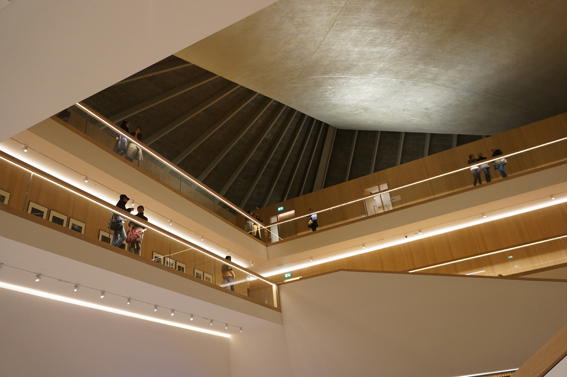
To my great disappointment the windows are nowhere to be seen for average museum visitors after renovation. Instead the main lobby / atrium is still completely without windows, which have been taken by the restaurant, ‘learning room’, offices and other rooms not accessible to public at all times.
Worse than that is the fact that John Pawson, the architect responsible for the new design, has ‘boxed’ the whole space. The original shape of the interiors, including the rare hyperbolic paraboloid roof, is only partly visible behind the new dominating, wooden ‘box frame’.
The museum entrance is to the vast and empty atrium space, which is a somewhat similar experience as in the Guggenheim museum, New York. The visitors are forced to walk around the atrium to gain access to upper floors. (The stairs are fairly narrow, which makes you wonder how is the traffic like in busier times). This makes a lot of sense in Guggenheim, where the art can be easily seen from open space galleries in each floor. However, this is not the case in Design museum. The galleries are behind narrow corridors. So walking around the atrium when you access the floors, you won’t see any art, instead you see corridors of closed doors. This gives a feeling like ‘being in the hotel’, as many visitors have already criticised. Also, in my opinion it gives a feeling of exclusion and non-transparency.
I hope that these awkward choices of using the space are the result of the fact that the project is (partly) privately funded. Swarovski sponsored learning centre has taken some valuable windows. Likewise the restaurant, which is hopefully a money maker. Otherwise, it is hard to understand the confusing logic of the interiors.
I agree with other critics that the permanent exhibition spaces are surprisingly small and therefore crammed. (I visited late in the evening, so not many people around).
The choice of the architect seems to be an unfortunate mistake. John Pawson’s minimal and restricted style doesn’t work in this original and unconventional building. Even the choice of using light wood is a mistake in such a hardwearing context. (The stairs looked already dirty).
All in all it feels like the user experience hasn’t been the starting point in designing these interiors. Which is tragic, as it is a Design Museum. Furthermore, the original architecture is not presented in the best possible way in my opinion. In the end the visitor will never know what caused this expensive design adventure.
If I hadn’t seen the space before the renovation, I am sure my views would be much more positive, but now it feels like a missed opportunity to present design for visitors. There are so many other museums and attractions that compete directly with it. The future will show how well the space will work or not.
