
This year’s Clerkenwell Design Week didn’t bring anything radically new to the event, but why fix if it isn’t broken? The event has grown into a nice manageable scale, which is a good thing. It still has a lot local flavour and a strong craft emphasis.
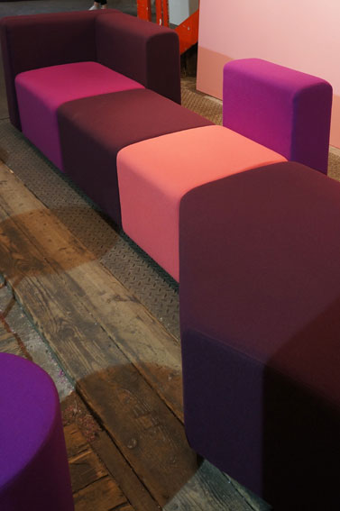
Among the very nicely curated collection of exhibitors, the most noticeable trend was colour. Whether it was pastels, brights or neon, it had a strong presence, immediately adding warmth and character to the grim industrial setting of the exhibition place.


It was not only about bright block colours, but also more sophisticated colour detailing. and combinations of materials, textures and finishes.
